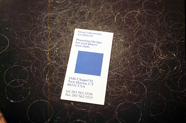
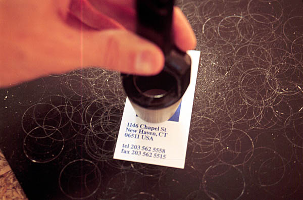
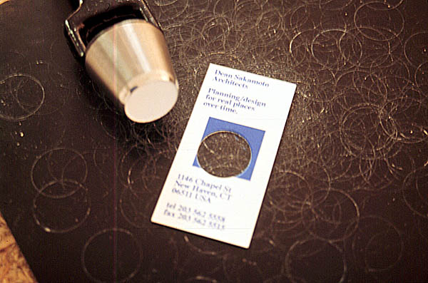
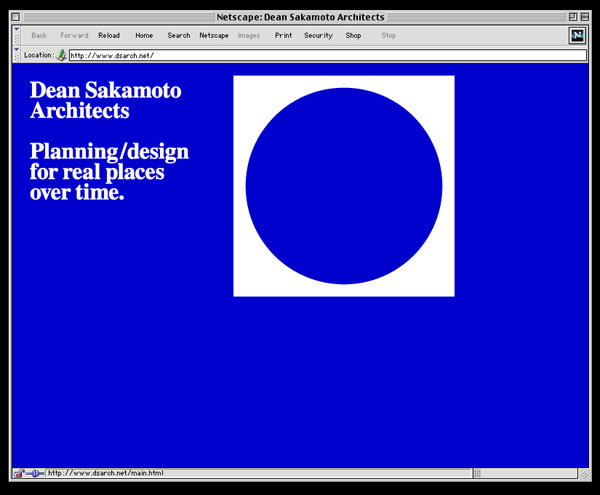
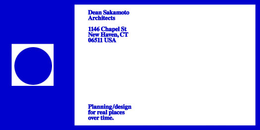
O R G / Dean Sakamoto Architects
Graphic identity for an architecture firm that focuses on a pragmatic approach to architectural design projects. This includes design of a logo mark, logo type, application to letterhead, business cards, envelopes, mailing labels, note paper and a website. The simple logo mark (a blue square) is cut through the middle with a 1" diameter hole, to make the distinctive graphic.